







Brand

The scribe’s mark

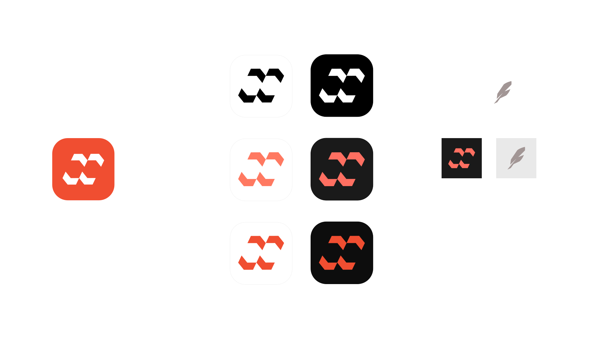
Nabu is named after the Mesopotamian god of writing, the patron of scribes. Its mark is an N drawn in negative space and, if you look again, a pair of quotation marks, or wedges a scribe would press into clay. Here is how to use it, and how not to.

00 · The mark

One mark, three readings

Reading 1 An N, in negative space The four strokes are the walls; the letter is the space between them. Look at the coral, not at the shapes.
Nobody had crossed since noon.
Reading 2 Quotation marks An opening pair below, a closing pair above: someone is speaking. Fitting, for an editor.
Reading 3 Wedges in clay The strokes a scribe pressed into wet clay with a reed: cuneiform, the writing Nabu was god of.
02 · Construction

How it is built

ascenderx-heightx-height ÷ 2baseline0.3 HH = 1.2 × asc.
  • The word is “nabu” in Syne 700, lowercase, tracked −0.02 em, drawn as outlines.
  • The mark is 1.2 × the height of the “b”, centred on the middle of the x-height, not sat on the baseline.
  • The gap between mark and word is 0.3 × the mark’s height.
  • Clear space around the lockup: the height of the “n”, on every side. Smallest size: 72 px wide (lockup), 16 px (mark alone).
03 · Icon

The mark alone

app · 512
touch · 180
tab · 32
16

For favicons, app icons and avatars, when the word would be too small to read. Coral on dark, coral vif on white. Never the other way round.

  • nabu-mark.svgThe mark alone, one colour (currentColor) Download
  • nabu-icon.svgApp icon, rounded square Download
  • nabu-icon-square.svgApp icon, square (for platforms that round it) Download
  • nabu-icon-512.pngApp icon, 512 × 512 px Download
  • apple-touch-icon.pngTouch icon, 180 × 180 px Download
  • favicon-32.pngFavicon, 32 × 32 px Download
  • nabu.svgThe original board, 1920 × 1080 (source drawing) Download
04 · Palette

Colour

Coral vif The mark on light backgrounds.
Coral pastel The mark and accents on dark.
Link coral Links and small text on light (AA).
Ink The word on light.
Paper The word on dark.
Night The site’s background.

Coral is an accent: one coral thing per screen is usually enough. Contrast: link coral on white 5.4:1, pastel on night 7.2:1, coral vif on white 3.6:1, so coral vif is for the mark and large type only, never for small text.

05 · Typography

Type

Titles · Syne 700 The last ferry Tight, −0.02 to −0.03 em. Never for body text.
Text · Inter The ferryman waited under the eaves, an unlit lantern in his hand. Nobody had crossed since noon. 400 for reading, 500–600 for labels.
Code · JetBrains Mono const nabu = createEditor(); Code, X-ray, small caps labels.
06 · Voice

How we sound

  • We say “we”.A project made by people, not a product talking about itself.
  • We show the numbers, the bad ones too.“88 ms at 10,000 blocks, and here is why” beats “blazing fast”.
  • Every claim links to its proof.A test, a lab, a line of code.
  • Short sentences. No superlatives.If it needs “revolutionary”, it isn’t.
  • We tell the story of our mistakes.We got regions wrong once. It’s a chapter.
07 · Our story

The ferryman

The ferryman waited under the eaves, an unlit lantern in his hand. Nobody had crossed since noon.

Every example in our docs, labs and tests tells the same little story: a river, a ferryman, a traveller who is late. Use it when you need sample text, never lorem ipsum.

  • the river
  • the lantern
  • the rope
  • the oar
  • the ford
  • noon
  • dusk on the quay
08 · Misuse

Please don’t

Don’t stretch it.
Don’t recolour the mark.
Nabu
Don’t retype the word or capitalise it.
Don’t use coral vif and ink on dark.
Don’t put it on busy pictures.
No shadows, glows or outlines.